
Interior Design Masters - Episode 5 Beach Huts
- May 20, 2022
- 11 min read

Our fifth challenge on Interior Design Masters sent us to the seaside where we had to design a beach hut in Walton-on-the-Naze! We each had our own hut this week, with a wide variety of briefs!
Judge Michelle said:
"Charlotte has the most incredible eye for colour, texture and pattern."
The Brief
Some of what I was told...
Local Area
Walton-on-the-Naze is a traditional British seaside resort town with sandy beaches, seafront gardens and quaint narrow streets. The Walton pier is the second longest in England offering fairground rides, ten pin bowling and sea angling. Situated on the Essex coast, the town has hundreds of classic and colourful beach huts which face a huge and a pristine blue flag beach, which is popular all year round with families, couples and dog walkers.
These huts are rented out to different visitors through every spring and summer, so the spaces must be hard wearing and functional and be able to withstand the unpredictable British weather, last the test of time, as well as multiple occupants.
Beachgoers come to the huts to have a fun day out and to relax with family and friends. They want to leave Walton-on-the-Naze, with fond memories of their stay. Immersing themselves into the beach hut lifestyle is all part of the experience.
The interior of each beach hut should be well designed, multifunctional, user friendly and not feel too cluttered. The overall aesthetic of the huts must feel fresh and stylish, with designs that don’t date too quickly.
Design Brief
New England and the Hamptons.
Vicki the owner of Isla would like an updated, more adult version of this scheme. The designer needs to think ‘out of the box hut’ from the predictable and common nautical blue and white colour palette. The hut needs to have a clean, high end finish with mix and match objects and furniture, but certainly not to feel cluttered. The interior should have a feeling of cosiness and warmth.
Paint & Colours
Due to the beach huts facing the seafront, they get battered by the elements all year round. It is important that the huts are painted in a durable exterior paint to prolong the colour, and lifespan of the huts and to reduce the need for maintenance. Water based Kitchen and Bathroom paints may also be suitable.
Furniture
The beach huts vary in size but are approximately 3.5m x 2.5m. Each hut must contain different types of multifunctional furniture which can provide multiple uses.
When the huts are hired out, they need to cater for anything from of 2–8 people, and maybe even a four-legged friend. Every beach hut requires plenty of clever accessible storage for the bucket and spade, body boards, inflatables, board games and other beach items that can be hidden away. The beach hut owners would also like some kind of stowable racking or drying system that can be used to dry bathing costumes and towels.
All the existing furniture in the beach huts can be kept, adapted, painted, reupholstered or upcycled if required. New furniture may be built or bought.
Additional accessible storage is needed for plates, cups and bowls and any other serving ware. Tables and chairs should able to be collapsible or stored away easily when not in use.
Each hut requires a small work surface prep area and a camping gas stove (supplied) for cooking light meals or boiling the kettle for that well-deserved cup of English Breakfast tea.
The huts would benefit from some kind of splashback behind the hob to protect the wooden shiplap walls from heat.
The owners would also like the designer to think about providing a reading nook or pod/mezzanine hidden area; and/or somewhere that parents could pop their young children down for a nap safely
Do's
Beach huts interior and exteriors need to be painted with durable outdoor paints like Sadolin and Weathersheild. Emulsion paints and garden wood stain products are not suitable.
Moisture Resistant (MR) MDF, Plywood, Chipboard, OSB and other MR woods and timbers should be used.
Oil cloths, canvas, kite fabrics, wax cloths and other waterproof and wipeable fabrics and materials are preferred.
Dont's
Furniture attached to the exterior of the huts is not permitted.
Standard interior paints are not suitable.
The stain glass windows inside the hut cannot be removed or changed.
Budget: £1000
My Beach Hut Design
'Think outside of the box hut' my brief said...
When I started delving into my research of design in The Hamptons I started noticing that aside from all of the common themes in interior design, Jackson Pollock kept popping up! This sparked my interest as I love a lot of 20th century artists and I thought this could lead to an interesting starting point in creating a scheme for my ambiguous brief!

This part of a New York Times article stuck out to me....
"And in any year, a tour of the home, studio and neighbourhood that Pollock and Krasner shared provides not only a window into their lives and work, but a sense of the Hamptons in a time when artists sought refuge amid their serene salt-scrubbed dunes and iridescent light.
From East Hampton village, with its mansions and expensive shops, roads lead through a less manicured landscape to the hamlet of Springs, where the status-seeking crowds fade and pebbled beaches ring Gardiners Bay. Towering silver maples and a sprawling cherry tree shelter the two-story former farmhouse that Pollock and Krasner bought there for $5,000 (all of it borrowed) in November 1945.
“It was the last great real estate deal in the Hamptons,” said Mike Hinkemeyer, 65, a bearded history professor turned novelist.
This last quote really resonated with me. I realised even though Pollock was a questionable character, he was a celebrated artist who contributed to the future desirability and 'coolness' of owning Hamptons real estate.
This research inspired me to make the below scheme and mood board for my hut!....
Moodboard
I wanted to create a scheme that included the common hampton's design characteristics like wide tongue and groove, striped fabric and dark wooden flooring, but add an artistic edge.

Design Visual

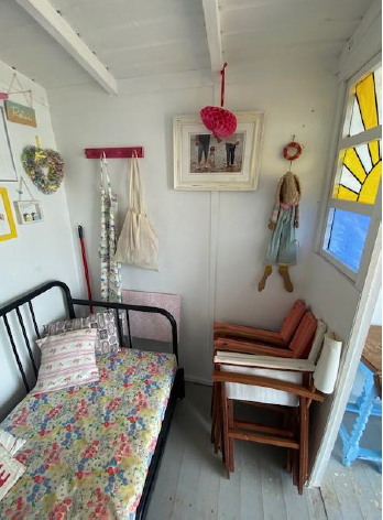
What it looked like before...


Colour
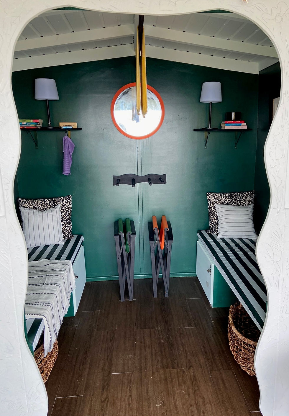
One of the main deliverables of my brief was to use an alternative to the stereotypical Hampton's nautical blue and white theme. The scheme still had to be sophisticated and bright, so I opted for a main colour of fresh mint, combined with black and orange accents (inspired by Pollock's artworks). I also didn't want to distract from the entire ocean, so thought the mint complemented it well! The stain glass windows were a central part to the hut that the owner loved and wanted to keep. I didn't want to distract from this, so I used opposing colours orange and lilac to make the window really pop!

Kitchenette
A mini kitchen area was an integral part of our brief. There were a lot of requirements for this area like a camping stove and splashback. This is my favourite part of the scheme as I love all the pops of colour against the wide tongue and groove wood work!


I went on the hunt for the perfect tile and found these sunny yellow beauties in Topps Tiles and fell in love with them. I liked the large, square simple shape and they were the perfect yellow pop for my hut! Plus it meant I learned to tile so I can now add that to the CV!


Easel Table
The brief asked for foldable, multi functional furniture. The table in the original hut took up a lot of floor space, so when I saw the plans I knew I wanted to create a table the came down from the wall and could fold away when not in use. After researching Jackson Pollock and him inspiring the artist residence side of my design concept, I thought it would be nice if the table doubled up as an artwork when not in use! The little hook at the top made it feel like an easel, and once I had created the artwork I was really pleased with it! I love how it looks with the extra wide tongue and groove that Piers made, and definitely felt it gave my hut a luxe, creative feel :)


Flower wall
A big part of my scheme that didn't really show up on the tv was my hand carved flower wall! Interiors schemes in The Hamptons often have floral fabrics of some kind - normally inky indigo watercolours. I wanted to add a floral element to my hut but not in an obvious way that has been done previously in Hamptons style schemes. Wallpapers and fabrics are tricky business for a beach hut so I had to think outside of the box! I covered the wall in gesso, and carved into it a variety of abstract floral motifs whilst it was still wet. I was so pleased with the effect and it added a really lovely softness to my hut. However, if I had my time again I would definitely have decorated this wall with something bolder (with more colour) that would have shown up better on camera!

Wave Arch
Part of my brief was that I had to keep the divider already in place in my hut. I thought, if I couldn't take it away, I would add to it! Piers built me a waved arch to sit bang in the middle of the hut as if it was part of the dividers. I hand drew the shape onto MDF so it mimicked a wave (as opposed to a perfect scallop edge). I was really pleased how it looked from different angles. Looking in it framed the hut, and looking out from the back it framed the sea!


Nooks
A big part of our brief was creating areas or 'nooks' for a range of uses. We all had to design an area that would be suitable for an adult reading, small child sleeping, 2-8 people sitting etc etc! Originally my hut had one day bed at the back, so I decided to split the space in two and use the centre for a board storage rack and drying pole (see image below). My lovely carpenter Piers built me storage cupboards under each side and I upholstered the two foam mini beds in the same waterproof fabric as the awning. I added Hamptons style oversized baskets to each side to store buckets and spades and dog toys!

I loved these oversized wicker baskets. I think they brought a softer, natural element to the space.

The owner of the beach huts sent me this photo after the episode and it filled me with SO MUCH JOY. This is Millie (who the huts are named after)! Her owner said she struggles to get her to relax when down at the huts, as she gets too excited and runs into all of the open huts. She said she's taken to one of my nooks as a place to relax so I couldn't be more thrilled. This area had to be designed to be cosy for sleeping children and get them out of the wind, but also our gorgeous furry friends!

I'm in love!! <3

Flooring
I looked to The Hamptons for flooring inspiration. I wanted the space to feel cosy, yet still be practical so opted for these dark brown vinyl floorboards. This isn't a great picture but I was so impressed with them! They are individual so could be placed staggered for a more natural homely feel.

Accessories
Hooks and Storage
Throughout the hut I wanted to create as much practical storage and hanging areas as possible. I used a lot of wooden 3D hooks throughout the hut, and painted them mint to blend in with the grooved walls. Near the doors and kitchenette, I wanted something more fun and quirky so opted for these hooks for towels and a designated furry friend!


I designed a wavy rack with long dividers that body boards etc could be slotted into, but also could also act as slight divide if a parent was reading in one nook and a child was asleep in the other.
I mirrored the shelving on each side, one side for children's books and games and the other side for adult books. I used weatherproof brackets that had hooks, so it could be another place for tea towels or swimsuits to finish up drying.

Enamelware
I opted for enamel ware for longevity as it didn't seem right bring lots of plastic down to the sea front. If the wind was to blow any plastic away it would end up in the sea and cause a lot of damage.
These enamel bowls were a bit of a splurge where our budgets were concerned, but I thought they were perfect tableware to use to mimic the Pollock artwork (I could only afford a couple though!)

I topped up my enamel offering with these mugs that I was able to get last minute after trying to get splatter enamel mugs in my budget for ages!

Woodwork
When researching The Hamptons real estate to look for repeat patterns that I could interpret for my hut, I noticed a lot of lattice motifs. Often these were in patterns for soft furnishings and brass finishings. I bought some brass lattice style handles for my cupboards, and wanted to work this idea into wood work for the front of the hut. I drew out four giant lattice shapes, one for each panel of the hut. They were painted black to fit in with the scheme and I thought they looked really crisp on the mint background. If I had my time again, I think I would have approached the front of the hut in a different way...probably by Pollocking the whole front/adding a full painted pattern to the doors! Once folded back for judging, you couldn't really see the lattice very well as they were tucked away. I tried to stick with the clean, crisp nature of Hamptons houses but in retrospect could have gone more off-brief as we were designing for TV and theres definitely different things to consider.

Upcycling
I kept the three foldaway chairs already in the hut to upcycle (they weren't in a good way so definitely needed some love!). On my week at home sourcing I was also able to get hold of two more from a charity shop; they were exactly the same and I now had a total of 4 for the beach hut! I painted them all in this rich black paint and upholstered two in the yellow stripe to sit out the front, and used the other two as extras for guests. I had some orange fabric to continue the orange pop throughout the hut.


I kept these two dining chairs to be used with my easel table. I up-cycled by painting them in the same black as the other chairs, and re-upholstered the seats in this gorgeous green stripe to match the awning and nook beds.


Fabrics
I absolutely love a fat stripe as we all know, and definitely think stripes evoke a nautical feeling - especially when used in a beach hut! Because I wasn't allowed to use blue and white in my scheme, I had great delight in choosing some new pops of colour! I went for the dark green and white to replace the blue and white normally seen in the Hamptons as I think it's still a sophisticated colour and still gives the nautical vibes. I coupled it with some fun pops of colour to give a bit more of myself to the scheme - I absolutely love this lilac and yellow combo giving me all the complimentary colour feels!
Shop the Yellow Stripe fabric here

Shop the Green Stripe fabric here

Shop the Lilac Stripe here

Awning
Another part of our brief was to create a bespoke awning that could protect from drizzle and sunshine! My hut was in a tricky location compared to the others as it was situated up some steep steps with only space for smaller directors chairs out the front. This meant I couldn't use some sort of pole as support for my awning as resting it on the steps would have been unsafe. I worked with Piers to design some slots for each far door, that a separate fold away awning could be slotted into. This worked well and felt really sturdy, plus when you didn't need the awning you rolled up (to the size of a small umbrella) and it could be stored back in a basket in the hut!

We painted the new woodwork to match the hut colour so it would blend in nicely.

I am a huge water baby and loved working out on the seaside this week! Unfortunately it was my time to leave the competition, but I am so grateful to have had the opportunity and am so excited about the dream interior projects I am currently working on!
Best of luck to the remaining contestants for the final few weeks! I loved the experiences the show gave us all and have been lucky enough to meet 9 other gorgeous designers that I can now call friends!
I can't wait for you all to see the rest of the series! I will post another blog about the designs I created for future episodes, as by this stage we knew the headline for the last few briefs - there's one commercial brief in particular I was super super excited to do!
Hope you enjoy, and please do get in touch for any interiors enquiries - big or small!
Lots of love,
Charlotte xoxo
Get The Artist Residence Look


Comments